![]()
Beautiful Plants For Your Interior
![]()
Beautiful Plants For Your Interior
Discover the secrets to mastering the art of food presentation with our comprehensive guide on pairing colors. Learn how to use color to elevate your culinary creations and make every dish a visual masterpiece. Explore techniques, tips, and examples to enhance your food presentation skills today!
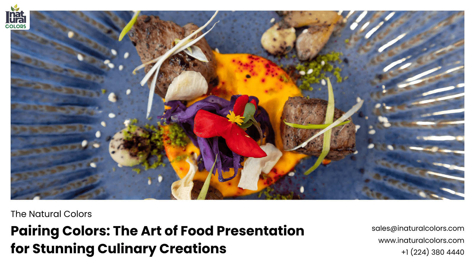
Ever noticed how a beautifully plated dish can make your mouth water even before you take a bite? That’s the magic of food presentation. While taste is crucial, the visual appeal of a dish can significantly enhance your dining experience. One of the key elements of food presentation is color. The right color combinations can turn an ordinary meal into a feast for the eyes and set the stage for an unforgettable culinary journey.
Colors have a profound impact on our emotions and perceptions. When it comes to food, colors can influence how we perceive taste and flavor. For instance, warm colors like red and orange are often associated with energy and appetite, making them ideal for dishes meant to be hearty and satisfying. On the other hand, cool colors like blue and green can evoke a sense of calm and freshness, perfect for salads and light meals.
Different cultures have unique associations with colors. In many Asian cultures, red symbolizes luck and prosperity, making it a popular choice for festive dishes. In contrast, white, often associated with purity in Western cultures, is linked to mourning in some Asian traditions. Understanding these cultural nuances can help in creating dishes that resonate on a deeper level with your audience.
The color wheel is a fundamental tool in art and design, and it’s just as useful in the culinary world. It helps us understand the relationships between colors and how to combine them harmoniously.
Complementary colors are opposite each other on the color wheel. Pairing these colors creates a vibrant, dynamic contrast that can make a dish stand out. Think of a dish with bright green peas and red bell peppers.
Analogous colors sit next to each other on the color wheel and blend well together. They create a serene and comfortable design. For example, a salad with various shades of green and yellow ingredients.
Triadic color schemes use three colors that are evenly spaced around the color wheel, providing a vibrant and balanced look. Tetradic schemes use four colors, creating rich and varied presentations. These schemes can be more complex but offer stunning results when done right.
Natural ingredients offer a beautiful palette of colors. Fruits, vegetables, herbs, and spices provide vivid hues that can enhance the visual appeal of your dishes without artificial coloring.
Combining warm and cool colors can create a balanced and visually appealing plate. For example, pairing a warm, orange carrot soup with a cool, green garnish can make the dish pop.
Playing with light and dark shades can add depth and dimension to your presentation. A dark chocolate dessert with a light raspberry coulis not only tastes great but looks sophisticated and elegant.
Asian cuisine often features vibrant colors from ingredients like red chilies, green herbs, and yellow turmeric. These colors not only add visual appeal but also hint at the flavors and spices used in the dish.
Mediterranean dishes are known for their fresh, colorful ingredients like tomatoes, olives, and fresh greens. The use of contrasting colors helps highlight the freshness and healthiness of the cuisine.
American cuisine can be diverse, but comfort foods often feature warm, inviting colors like golden browns and rich reds. Think of a classic BBQ plate with its array of smoky, grilled meats and colorful sides.
Fusion cuisine blends elements from different culinary traditions, offering a playground for creative color pairings. The mix of diverse ingredients can result in unique and visually stunning dishes.
The color of your plate can significantly affect the presentation of your food. White plates are a popular choice as they make colors pop, but experimenting with different plate colors can create interesting effects. For example, a dark plate can make light-colored foods stand out dramatically.
How you arrange the food on the plate is crucial. Use the rule of thirds, leave some negative space, and consider the flow of the colors on the plate to create a visually pleasing presentation.
Garnishes can add the final touch to a dish, providing a burst of color and an extra layer of texture. Fresh herbs, edible flowers, and colorful sauces are excellent choices for garnishing.
Color palette generators can help you find harmonious color combinations. Tools like Adobe Color can be a great resource for chefs looking to experiment with new color schemes.
Food photography apps can offer inspiration and help you see how different color combinations work together in a dish. They also provide a way to test and refine your color pairings before presenting them to guests.
Professional chefs have a wealth of knowledge when it comes to color pairing. Learning from their tips and tricks can elevate your food presentation skills. Watch cooking shows, read culinary books, and practice regularly to improve.
Some dishes are renowned for their stunning color schemes. For instance, the vibrant colors of a classic ratatouille or the contrasting hues in a caprese salad are perfect examples of successful color pairing.
Many top-tier restaurants use color pairing to create memorable dining experiences. Analyzing their techniques can provide valuable insights into how to apply these principles in your own kitchen.
Use fresh, seasonal ingredients to get the best natural colors. Cooking methods like roasting and grilling can also enhance the color of your ingredients.
Experiment with homemade garnishes and sauces to add color to your dishes. A drizzle of beet puree or a sprinkle of pomegranate seeds can make a big difference.
Pairing colors in food presentation is an art that can transform your culinary creations. By understanding the basics of color theory and experimenting with different techniques, you can elevate your dishes from simple meals to visual masterpieces. So, don’t be afraid to play with your food – let your creativity shine on the plate!
What colors make food look appetizing?
Warm colors like red, orange, and yellow tend to make food look more appetizing and can stimulate hunger.
How can I naturally enhance the color of my dishes?
Using fresh, high-quality ingredients and incorporating colorful fruits and vegetables can naturally enhance the color of your dishes.
Are there any colors to avoid in food presentation?
Avoid using too much brown or gray, as these colors can be unappetizing. Balance them with more vibrant colors to keep the dish visually appealing.
How does plate color affect food presentation?
The color of the plate can influence how the colors of the food are perceived. White plates tend to make colors pop, while darker plates can provide a dramatic contrast.
Can color pairing affect the taste perception of food?
Yes, color pairing can affect how we perceive the taste of food. For example, brighter colors can make food seem fresher and more flavorful, while dull colors might make it appear less appetizing.